Portfolio
A4D PizzaBuild your pizza, topping by topping

Pinch to zoom into any board for detail.
UI/UX Case Study

A4D
Pizza

Build it your way.
Track it to your door.

A pizza ordering app where you pick your own toppings, see the full bill before paying, pay the way you like and follow the rider live.

Mobile app UI/UX design Food delivery Figma
Designed by Krithik Ram R K
My Cart screen with bill details and delivery address
Order received screen with delivery time and order details
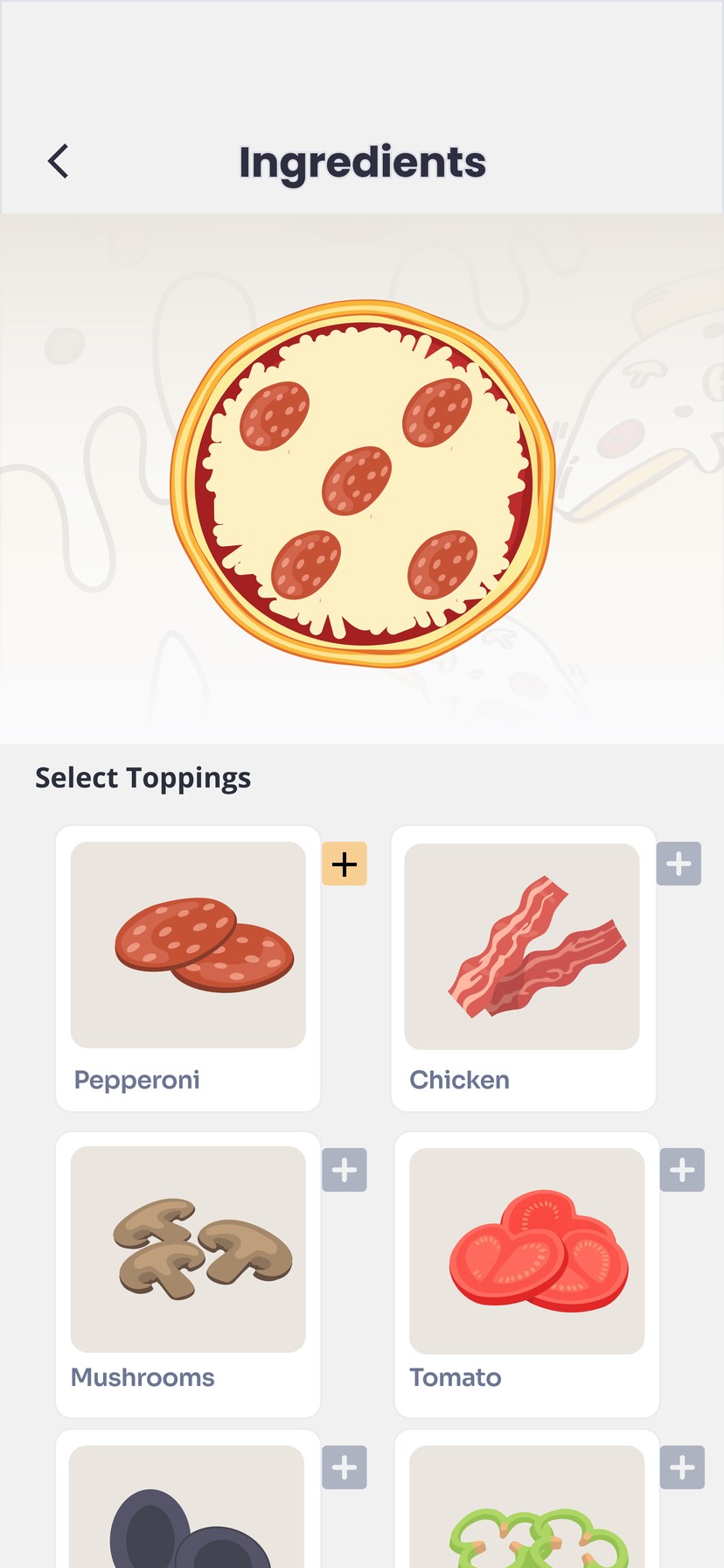
Ingredients screen showing a pepperoni pizza preview above topping cards
01 — OVERVIEW

Ordering a pizza should feel as simple as asking for one at the counter.

A4D Pizza is a pizza ordering app built around one idea: you stay in control. You build your pizza topping by topping, check every rupee before you pay, choose how to pay, and follow the order on a live map.

I designed the ordering flow end to end, from building the pizza to tracking the rider, plus the account menu.

ROLE UI/UX Designer
PLATFORM Mobile app · 414 × 896
TOOLS Figma
TIMELINE [Add timeline]
DELIVERABLES Persona, journey, 9 screens
Build your own

Tap a topping and watch it land on the pizza preview.

A clear bill

Subtotal, delivery fee and tax on separate lines before you pay.

Pay your way

Saved cards, UPI, Google Pay, net banking or cash on delivery.

Track it live

A map, an arrival time and the rider’s name, one tap from a call.

02 — THE PROBLEM

Surprise fees at checkout and silence after paying are where food orders go wrong.

70%

of online shopping carts are abandoned on average, across 50 studies compiled by Baymard Institute.

48%

of US shoppers in a 2024 Baymard survey left a cart because extra costs like delivery, tax and fees were too high.

85.5%

of India’s payment transactions by volume ran on UPI in the second half of 2025, so the payment screen has to put it first.

On a ₹299 pizza, a ₹14 delivery fee and ₹19 in tax that appear only at the last step feel like a trick.

And once the money is gone, a vague “on the way” leaves people refreshing the app and wondering whether to call.

HOW MIGHT WE

Let people build exactly the pizza they want, see the real total before paying, and follow it to their door?

Sources: Baymard Institute, cart abandonment rate statistics; Baymard survey of 1,012 US adults (Feb 2024), via eMarketer; RBI Payment Systems Report (Dec 2025), via IANS.

03 — USER PERSONA

Meet Arun: hungry, busy and particular about his pizza.

Proto-persona · validate with interviews
AP
Arun Prakash
The late-night orderer
AGE27
LIVES INErode, Tamil Nadu
WORKIT support, rotating shifts
ORDERS2–3 times a month
PAYS WITHUPI, cash as backup

“Let me build it my way, show me the real total, and tell me when it’s here.”

Arun works rotating shifts at an IT services company. When he orders in, it’s usually late and often for two or three friends, so he wants it fast and exactly right. He’s tired of paying for toppings he picks off, and of fees that only show up at the last step.

GOALS
Build a pizza with only the toppings he wants
See the final amount before he pays
Pay with UPI, or cash when UPI won’t go through
Know exactly when the food will arrive
FRUSTRATIONS
Set menu pizzas with toppings he doesn’t want
Delivery fee and tax that appear only at the end
“On the way” with no map and no time
Typing his address again on every order
HABITS
Orders late in the evening, often for friends
Keeps his phone in dark mode at night
Reads the bill line by line before paying
PERSONALITY
Tech comfortHigh
Price sensitivityMedium–high
Patience while waitingLow
04 — USER JOURNEY

Arun’s order, from craving to doorbell.

01Craving
02Building
03Reviewing
04Paying
05Waiting
DOING
Opens the app after a late shift, friends waiting.
Taps toppings and watches the pizza fill up.
Checks the bill and the delivery address.
Picks UPI, or cash if UPI is acting up.
Keeps checking where the rider is.
THINKING
“Pepperoni. Nothing else.”
“Nice, that’s exactly what I’ll get.”
“Any hidden charges?”
“UPI or cash today?”
“How long now?”
FEELING
Hungry, impatient
In control
Wary
Relieved
Restless
PAIN POINT
Set menus force toppings he doesn’t want.
Can’t tell what the pizza will look like.
Fees and tax that appear late feel like a trick.
His preferred way to pay is buried or missing.
“On the way” tells him nothing.
HOW A4D HELPS
A build-your-own flow, topping by topping.
Live pizza preview; Next unlocks after a topping.
Subtotal, delivery and tax on separate lines.
Cards, UPI, Google Pay, net banking and cash on one screen.
ETA, live map, rider’s name and Contact Driver.
05 — USER FLOW
Five steps from toppings to tracking.
The main order path, two side paths, and the account menu.
Build your pizza
My Cart
Payment
Order received
Order status
Set location on map
Cancel order
Contact driver
change
confirm
ACCOUNT MENU
Menu
Dark mode toggle
Your favourites
Address management
Payment methods
Coupons
Order history
Support center
Dashed boxes are side paths. Home and the pizza list come before this flow and aren’t part of this set of screens.
06 — VISUAL LANGUAGE

Warm orange, soft greys and a pizza that does the talking.
THE HERO
A4D Pizza

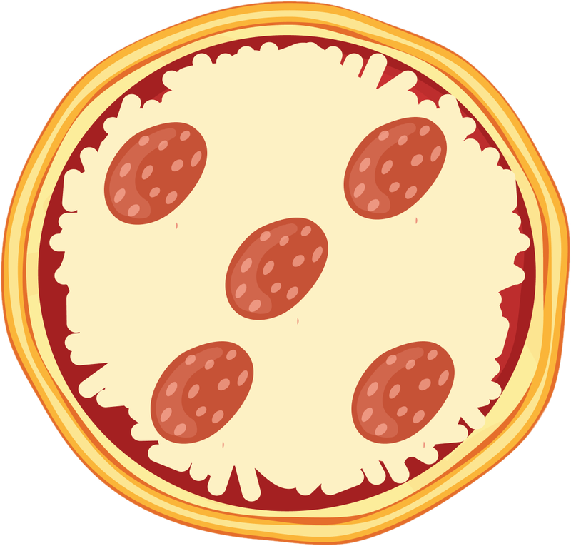
The illustrated pizza is the brand. It fills up as you add toppings, so what you see is what arrives.

COLOUR
A4D Orange
#FFA200
Main buttons, active states
Soft Orange
#FFAC33
Selected topping, Back button
Charcoal
#424347
Titles and headings
Cloud
#F1F1F1
Screen background
White
#FFFFFF
Cards and sheets
Disabled greys
#E4E4EB · #B5B5B8
Buttons that aren’t ready yet
TYPE
Aa
Geometric sans
Poppins Bold on the Ingredients header
Order received 28 · Bold
Screen header 24 · Bold
Item, button label 20 · SemiBold
Section, total 18 · SemiBold
Body, bill rows 15 · Regular
Caption, order number 13 · Regular
Sizes in pt, measured from the 414 × 896 frames.
COMPONENTS
Buttons: ready and not yet
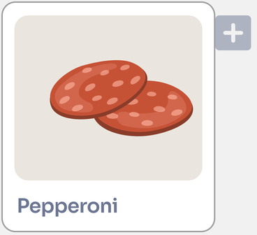
Topping card: default and added
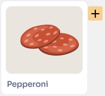
Pepperoni topping card with a grey plus buttonDefault: grey +
Pepperoni topping card with an orange plus button, addedAdded: orange +
Payment option
Quantity
1
07 — BUILD YOUR PIZZA

Topping by topping, and you watch it happen.

The full Ingredients screen, before and after one tap. Everything about the pizza is decided here, so this screen had to feel playful and impossible to get wrong.
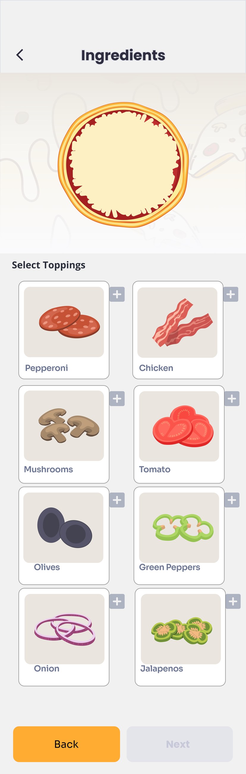
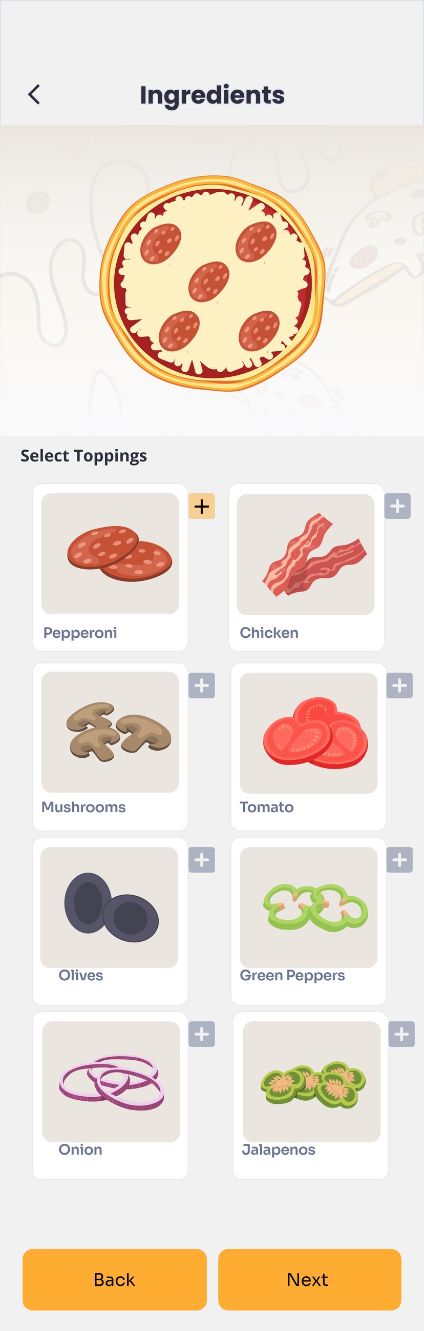
1The pizza preview updates the moment a topping is added: what you see is what you’ll get.
2Big illustrated cards make each topping easy to recognise at a glance.
3Next stays greyed out until a topping is picked, then turns orange.
4An added topping’s + turns orange, so the choice also shows in the grid.
BEFORE · EMPTY BASE
Full Ingredients screen with a plain cheese base and the Next button disabled
3
Tap +
AFTER · PEPPERONI ADDED
Full Ingredients screen with pepperoni on the pizza, an orange plus on the Pepperoni card and Next enabled
1
2
4
3
08 — CHECKOUT

No surprises at the bill, no dead ends at payment.
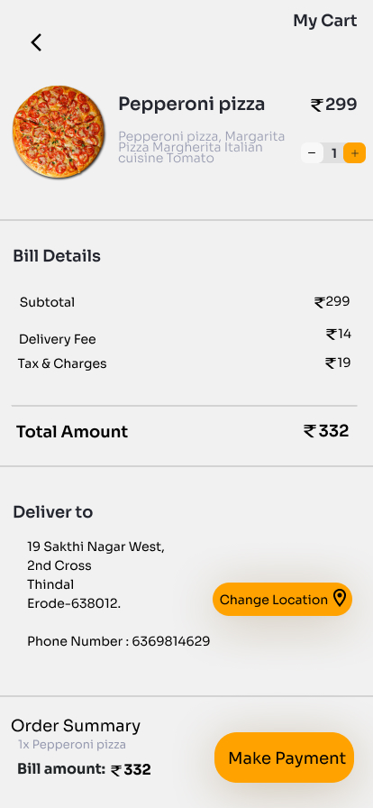
My Cart with the pizza, a quantity stepper, bill details, delivery address and Make Payment
My Cart

Subtotal, delivery fee and tax each get their own line before one bold total. The address and Change Location sit on the same screen.
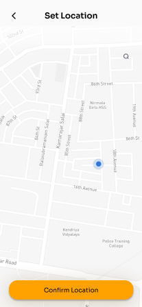
Set Location map with a blue pin and a Confirm Location button
Set location

Drop a pin on the map and confirm. One button, nothing to type.
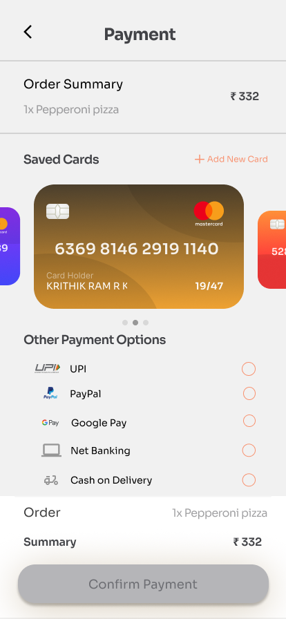
Payment screen with saved cards, other payment options and a grey Confirm Payment button
Payment

Saved cards swipe sideways, with UPI, Google Pay, net banking and cash below. Confirm stays grey until a method is picked.
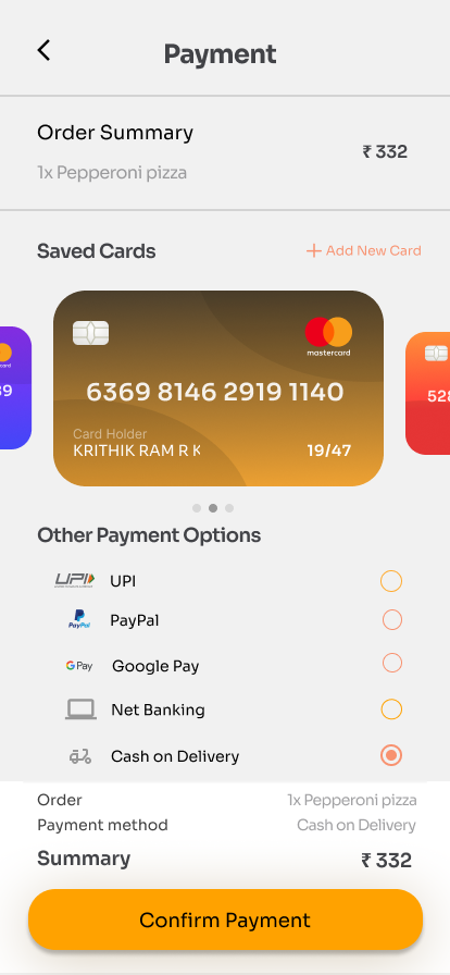
Payment screen with Cash on Delivery selected and an orange Confirm Payment button
Method picked

Choose Cash on Delivery and the summary adds the method, while Confirm Payment turns orange.

09 — AFTER THE ORDER

After you pay, the app keeps you in the loop.
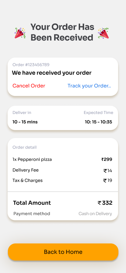
Order received screen with Cancel Order and Track your Order links, delivery time and order detail
1
2
3
Order received
1Cancel and Track sit side by side the moment the order lands.
2A delivery window and an expected time, before anyone has to ask.
3The full bill again, with the payment method, for a last check.
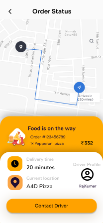
Order Status screen with a route map, arrival time, order card, rider profile and Contact Driver button
4
5
6
Order status
4A live map with the route and a clear “Arrives in 20 mins”.
5Order number, item and amount stay in view while you wait.
6The rider’s name and one big Contact Driver button.
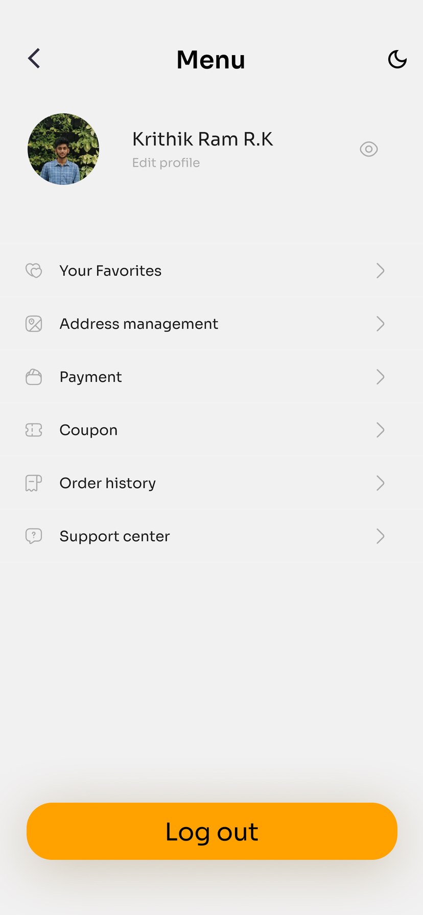
Menu screen with profile, dark mode toggle, account options and Log out
7
8
9
Menu
7Dark mode is one tap away in the header, handy for late-night orders.
8Favourites, addresses, payment, coupons, history and support in one list.
9Log out is clear but kept at the bottom, away from everyday taps.
10 — WHAT I’D IMPROVE NEXT

A first version is a hypothesis. Here’s what I’d change and test next.

01
Drop PayPal, lead with UPI.

PayPal stopped domestic payments in India on 1 April 2021, so a customer here can’t use it to pay a local pizza shop. UPI carries most payments in India, so it belongs at the top.

BEFORE · OTHER PAYMENT OPTIONS

UPI · PayPal · Google Pay · Net Banking · Cash on Delivery

AFTER

UPI · Google Pay · Net Banking · Cash on Delivery

02
Mask saved card numbers

Show •••• 1140 instead of all 16 digits, with the expiry as a real MM/YY date.

03
Show prices while building

Put each topping’s price on its card and a running total under the pizza, and add size and crust choices.

04
Replace placeholder content

The cart’s item description reads like a keyword list, and the Chicken card’s picture looks like bacon strips.

05
One arrival time everywhere

Confirmation says 10–15 mins and tracking says 20 mins. Show one live estimate on both screens.

06
Keep colours and type consistent

Cancel (red) and Track (blue) sit outside the palette, and the Ingredients title uses Poppins while every other screen uses the UI sans.

07
Test it with real people

Usability-test the build, pay and track flow with people like Arun, then iterate.

Sources: PayPal statement on ending domestic payments in India (Feb 2021), via Reuters and TechCrunch; RBI Payment Systems Report (Dec 2025).

A4D PIZZA · UI/UX CASE STUDY
Thank you.
Designed by Krithik Ram R K · UI/UX Designer
[Portfolio link] [LinkedIn] [Email]