Portfolio
HemoglobinBlood donation, matched by group and place

Pinch to zoom into any board for detail.

UI/UX Case Study
Hemoglobin logo: a blood drop drawn as one line that loops into a heart

HEMOGLOBIN

We all can donate blood

A mobile app that connects people who need blood with willing donors nearby: find a match, post a request, or answer one in minutes.

Mobile app UI/UX design Healthcare Figma
Designed by Krithik Ram R K
Welcome screen with the Hemoglobin logo, Log in and Register buttons
Donor profile screen with Call Now and Request buttons and a map
Find Donors screen listing donors with their city and blood group
01 — OVERVIEW

Finding blood in an emergency shouldn’t depend on who you know.

Hemoglobin brings blood donors and the people who need them into one app. You register once with your blood group and city. After that you can search for matching donors nearby, post an urgent request, or answer requests from hospitals around you.

I designed the brand, the user flows and 16 high-fidelity screens, from the splash screen to a guided donation assistant.

ROLE UI/UX Designer
PLATFORM Mobile app · 414 × 896
TOOLS Figma
TIMELINE [Add timeline]
DELIVERABLES Logo, user flows, 16 screens
Find donors

Filter by blood group and location, then call or send a request from the donor’s profile.

Post a request

City, hospital, blood type, mobile and a note: five fields, and the request is live.

Answer requests

A live feed of nearby requests, each with the hospital, blood group and time posted.

Track your giving

An availability switch, donation count, blood report and a guided assistant.

02 — THE PROBLEM

On paper, India collects enough blood. Finding the right donor, nearby and in time, still runs on phone calls.

14.6M

units a year: India’s requirement, as stated in Parliament. National collection reached it in 2024–25, but supply is uneven.

46%

of India’s population lives in eight states that a 2024 study called an effective “blood desert”, based on blood available within 60 minutes.

1 in 4

units is still given by family and friends asked to replace blood, rather than by voluntary donors.

When a patient needs blood, the search often falls on the family: calling relatives, forwarding messages to group chats, going from hospital to hospital.

Willing donors exist. What’s missing is one place to find them by blood group and distance, and a simple way to ask.

HOW MIGHT WE

Help a patient’s family find a matching, willing donor nearby in minutes, not hours of phone calls?

Sources: Government reply in the Rajya Sabha (Aug 2025) and a 2024 study of blood availability in eight states (E-Raktkosh data), both as reported by Newslaundry (Mar 2026); ISBT Transfusion Today, “Unmet needs for blood transfusion in India” (Jul 2025).

03 — WHO IT’S FOR

Two people, one moment of need.

Every donation has two sides. These proto-personas come from secondary research and the app’s flows. Interviews with real requesters and donors are the next step.

The Requester
A patient’s family member, often at the hospital, always in a hurry.
NEEDS
A donor with the exact blood group, close to the hospital
A way to reach that donor directly, right now
To ask beyond their own phone contacts
FRUSTRATIONS
Calling people one by one with no idea who can donate
Forwarded messages that lose the details along the way
WHERE HEMOGLOBIN HELPS
Blood group filter Donor profile + Call Now Create a request
The Donor
A healthy adult who’s willing to give, if the time and place work.
NEEDS
To see genuine requests near them
To say when they can donate, and when they can’t
To feel that their giving counts
FRUSTRATIONS
Requests with no hospital, contact or time
Being called when they aren’t able to donate
WHERE HEMOGLOBIN HELPS
Donation request feed Availability toggle Donation count + report
04 — USER FLOW
From first launch to a donor on the line.
How a new user gets in, and the paths that lead to a donation.
Splash
Onboarding · 3 slides
Welcome
Log in
Home
Register
Registration successful
Find donors
Create a request
Donation requests
Profile
Assistant
Filter by blood group & location
City, hospital, blood group, mobile, note
Pick a request near you
Toggle availability
Donation instructions, step by step
Donor profile
Request posted
Donate
Blood report
Call now or send a request
new user
Entry and account
Main features
Goal reached
The main features sit on a five-item bottom bar with a raised drop button in the centre.
05 — VISUAL LANGUAGE

A warm red, a calm teal and one friendly typeface.

LOGO
Hemoglobin logo mark in white
HEMOGLOBIN
We all can donate blood

One continuous line draws a drop of blood and loops into a heart: giving and caring in a single stroke.

COLOUR
Hemoglobin Red
#FF2056
Brand, primary actions
Blush & Petal
#FF6086 · #FFC6D5
Splash waves, illustrations
Calm Teal
#679593
Secondary action: Call Now
Ink
#272A2F
Titles, names
Slate
#7E7E7E
Body copy, captions
Mist
#F8F8F8
Input fields, quiet surfaces
TYPE
Aa
Poppins
Geometric, rounded, friendly
Regular Medium SemiBold Bold
Profile name 28 · SemiBold
Onboarding title 24 · Medium
Screen header 22 · Medium
Body copy 16–18 · Regular
Caption 12 · Regular
Sizes in pt, measured from the 414 × 896 frames.
COMPONENTS
Buttons
Input field
Blood group chips
A+ A− B+ B− O+ AB+ AB−
Blood group badge
B+ O+ AB+

The drop doubles as the brand shape, so blood group reads first on every card.

06 — FIRST IMPRESSIONS

Two slides explain the app, then one screen splits new and returning users.

Splash screen with layered pink waves at the bottom
Splash

Layered pink waves bring in the brand colour from the very first second.
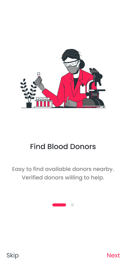
Onboarding slide: Find Blood Donors, with a lab illustration
Find blood donors

One promise per slide, told with an illustration in the brand red.
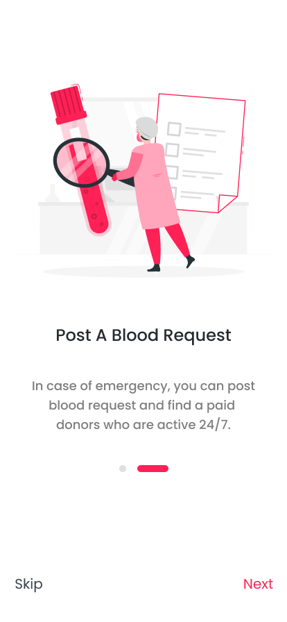
Onboarding slide: Post A Blood Request, with a test tube illustration
Post a blood request

Skip sits bottom-left on every slide; Next is the red action on the right.
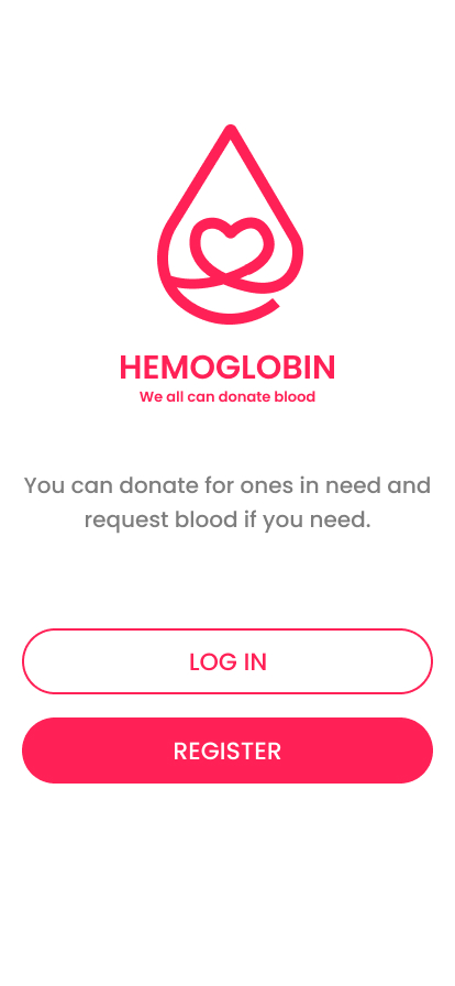
Welcome screen with the logo, an outline Log in button and a filled Register button
Welcome

A filled Register button and an outline Log in: two paths, one clear default.

07 — GETTING IN

Sign-up asks for what matching needs: blood group and city.
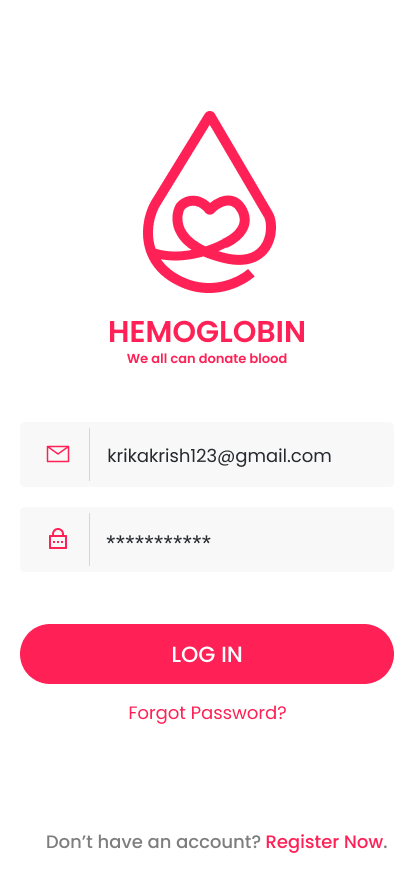
Log in screen with email and password fields
1
2
Log in
1Each field leads with an icon and a divider, so it reads clearly without a floating label.
2Forgot Password sits right under the button; Register Now waits at the bottom for new users.
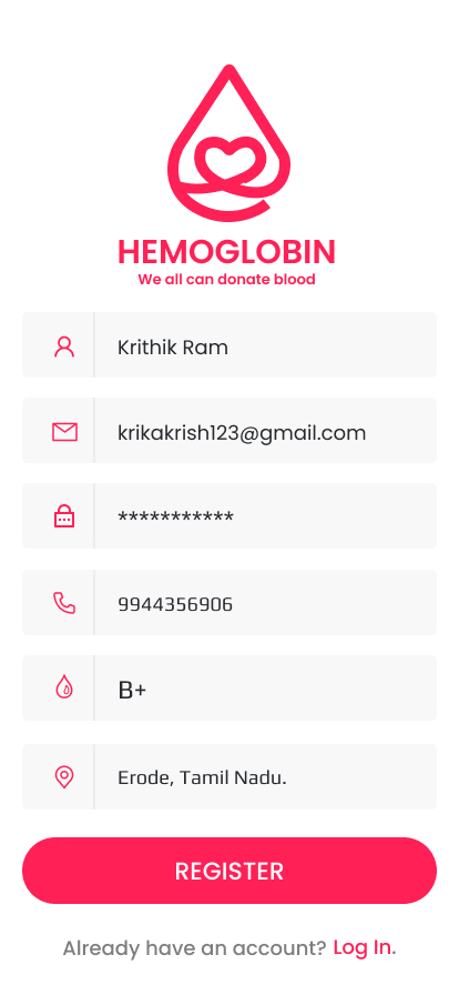
Register screen with name, email, password, phone, blood group and city fields
3
4
Register
3Blood group and city are asked at sign-up, so the very first search already knows what to match.
4All six fields on one screen, with no multi-step wizard to get lost in.
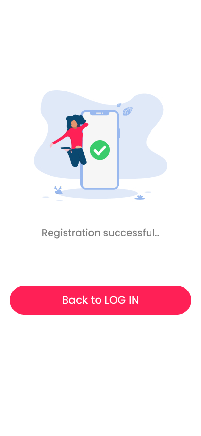
Registration successful screen with an illustration and a Back to Log in button
5
Registration successful
5A cheerful illustration confirms the account, with one clear button back to log in.
08 — FINDING A DONOR

From a filtered list to a donor’s phone in a few taps.
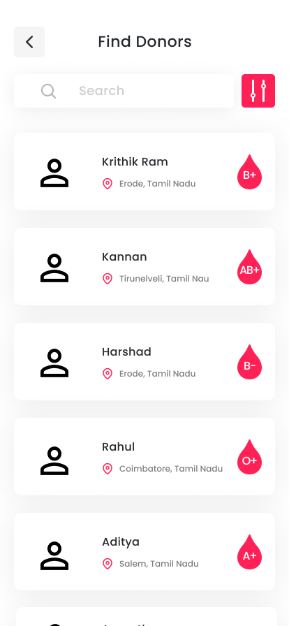
Find Donors list with each donor’s city and a red blood group drop
1
2
Find donors
1Blood group sits in a drop badge, the first thing the eye lands on, so the list scans by group before names.
2Filters stay one tap away, right beside search.
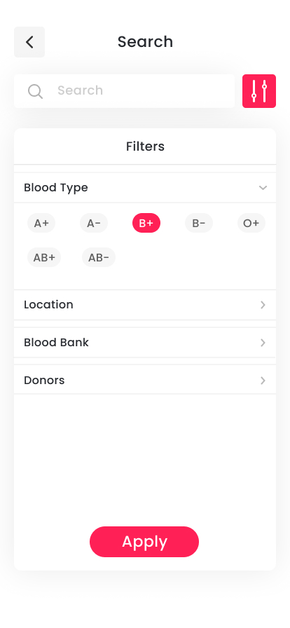
Search filters with blood group chips, B+ selected, and an Apply button
3
4
Filters
3Blood groups as chips: one tap picks, and red marks the choice.
4Location, blood bank and donor type open only when needed, and one Apply button closes the loop.
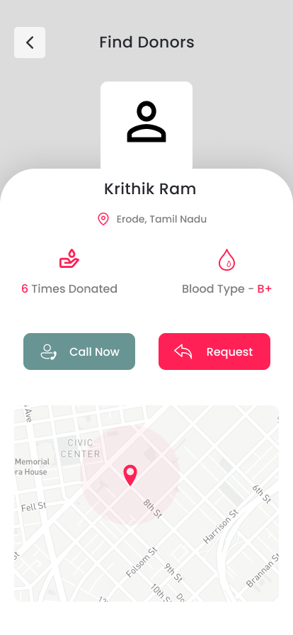
Donor profile with times donated, blood group, Call Now and Request buttons, and a map
5
6
7
Donor profile
5“6 Times Donated” builds trust before anyone picks up the phone.
6Two actions, two colours: teal Call Now for right now, red Request for a written ask.
7The map shows an area, not an address: enough to judge distance while keeping the donor’s home private.
09 — ASKING FOR BLOOD

Post a request in five fields, and see who nearby needs help.
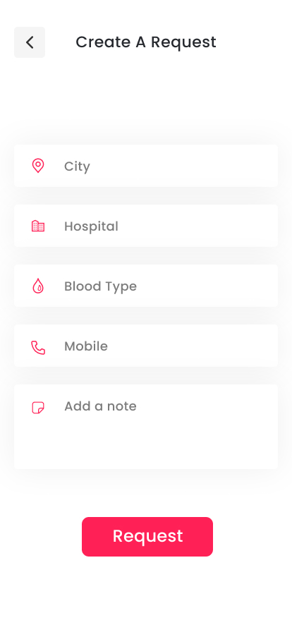
Create A Request form with city, hospital, blood type, mobile and note fields
1
2
3
Create a request
1Five fields, each with an icon, so a stressed family member can fill it in fast.
2A free-text note covers details like ward, units needed or timing.
3One Request button, centred and red.
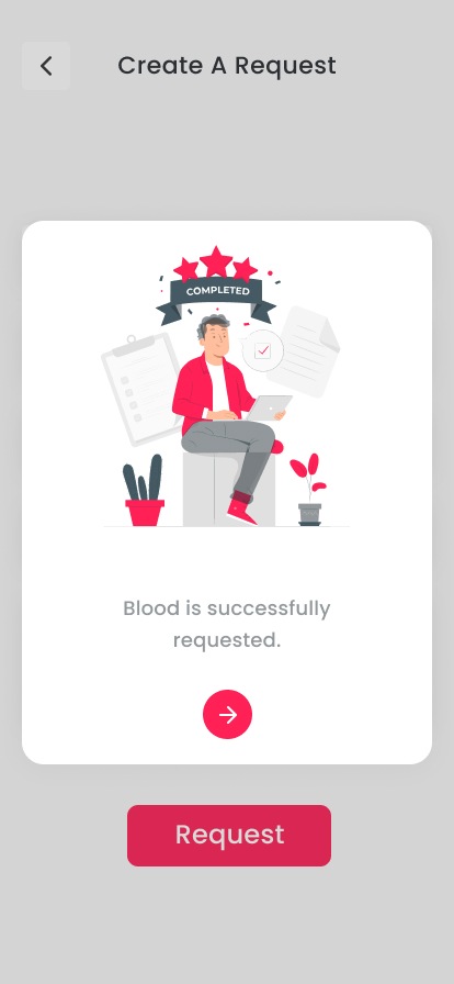
Request confirmation card: Blood is successfully requested, with an arrow button
4
Request posted
4A clear confirmation and a single arrow forward, so nobody wonders whether it worked.
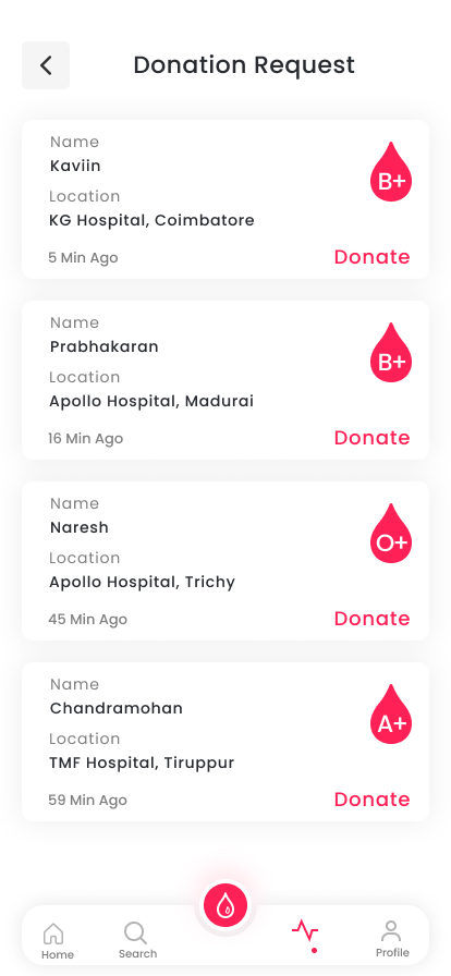
Donation Request feed with name, hospital, time posted, blood group and a Donate link on each card
5
6
7
Donation requests
5Time since posting signals urgency at a glance.
6Name, hospital and blood group on every card, with Donate as the only action.
7The raised drop button keeps a new request one tap away from every tab.
10 — STAYING READY TO GIVE

Your giving, your health and your availability, in one place.
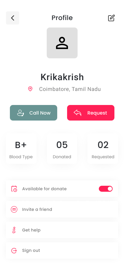
Profile screen with blood group, donated and requested counts, and an availability toggle
1
2
3
Profile
1Blood group, donations and requests at a glance, in three equal tiles.
2One toggle tells requesters whether you can donate right now.
3Invite a friend grows the donor pool from inside the app.
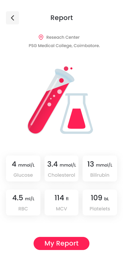
Blood report screen with six lab values in tiles and a My Report button
4
5
Blood report
4The report names the lab behind it.
5Six key values, each in its own tile with its unit.
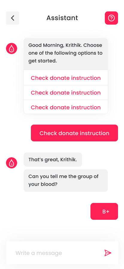
Assistant chat with tappable options and a B+ reply chip
6
7
Assistant
6The assistant opens with tappable options instead of an empty chat box.
7Answers come back as chips, so the chat feels like a quick, friendly form.
11 — WHAT I’D IMPROVE NEXT

A first version is a hypothesis. Here’s what I’d change and test next.

01
Say “voluntary”, not “paid”.

India banned paid (professional) blood donation from 1 January 1998, and its blood system relies on voluntary, unpaid donors. The onboarding copy should say the same.

BEFORE · ONBOARDING SLIDE 2

In case of emergency, you can post blood request and find a paid donors who are active 24/7.

AFTER

In an emergency, post a request and reach verified voluntary donors near you.

02
Include all eight blood groups

The filter shows seven chips. O−, the universal red-cell donor, is missing.

03
Show when a donor can give again

NBTC guidelines set a 90-day gap between whole-blood donations for men and 120 days for women. A countdown on the profile would stop requests to donors who aren’t eligible yet.

04
Keep numbers private until a donor says yes

Route first contact through Request, and reveal Call Now only once the donor accepts.

05
Make urgency and quantity explicit

Add units needed and a “needed by” time to each request, so donors can decide which to answer first.

06
Raise contrast on small red text

#FF2056 on white is 3.75:1. A deeper #E0003A reaches 4.96:1, which passes WCAG AA for body-size text.

07
Test it with real people

Run usability tests on the find-donor and request flows with both requesters and donors, then iterate.

Sources: DGHS, Ministry of Health & Family Welfare, Blood Transfusion Services history (ban on paid donation by 1998); NBTC donor selection guidelines (2017).

Hemoglobin logo mark
Thank you.
Designed by Krithik Ram R K · UI/UX Designer
[Portfolio link] [LinkedIn] [Email]