Pinch to zoom into any board for detail.
A fashion marketplace that sets itself up around your brands and your size.
Poshmark is a social marketplace where people buy and sell new and pre-loved fashion, and follow each other’s closets. This concept reimagines its first-run experience for shoppers in India.
I designed the journey from splash screen to a personalised profile: onboarding, four ways in, a two-step sign-up, finding friends, following brands and saving shirt and shoe sizes.
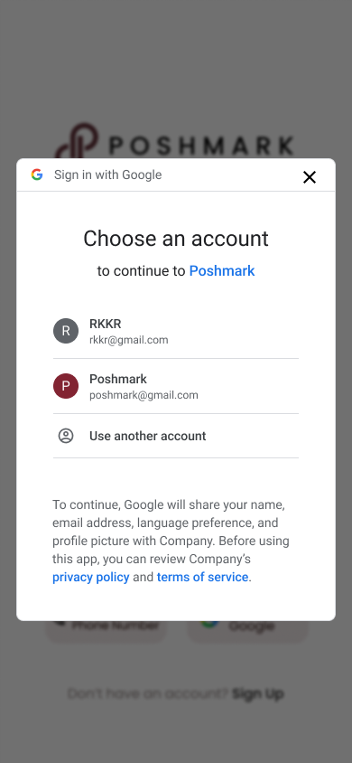
Email, a phone number with +91 preset, or Google, all from one screen.
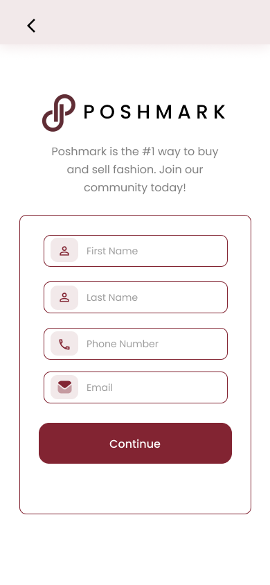
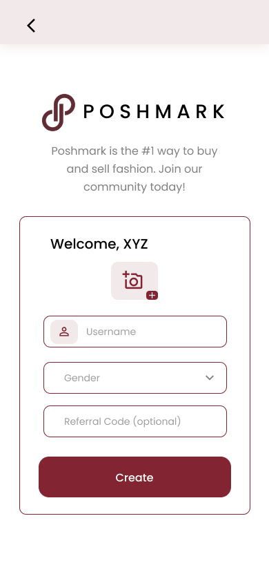
Name and contact first, then a photo, username and an optional referral code.
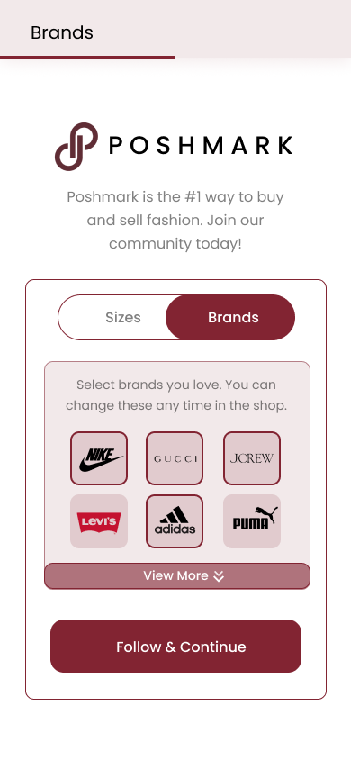
Tap logos in a grid, or search the full list and follow from there.
Shirt and shoe sizes, with Standard or Big & Tall and UK/India or EU.
Shoppers want an app that knows their style and size, without a long sign-up to get there.
of US shoppers who abandoned a checkout said it was because the site wanted them to create an account.
of consumers expect companies to personalise their interactions, and 76% get frustrated when it doesn’t happen.
returns just because an item doesn’t fit, under Poshmark’s buyer protection. Buyers are told to re-list it instead.
Poshmark launched in India in 2021, then closed its India, UK and Australia marketplaces in October 2023 to focus on the US and Canada.
This concept asks what a first run built for Indian shoppers could look like: phone-first sign-in, brands to follow, and sizes saved before anyone buys something that won’t fit.
Get new shoppers from install to a feed of their brands, in their size, with as little typing as possible?
Sources: Baymard Institute, reasons for checkout abandonment (survey of US online shoppers); McKinsey, “The value of getting personalization right—or wrong—is multiplying” (2021); Poshmark, Posh Protect policy; TechCrunch and PYMNTS on Poshmark’s 2023 exit from India, the UK and Australia.
Meet Arjun: he wants real brands for less, in a size that fits.
Arjun’s first ten minutes, from a friend’s link to a feed in his size.
One maroon for every action, soft blush for everything around it.
WCAG AA asks for at least 4.5:1 for body text. Darkening the grey to #6E6E6E, and the bar to the brand maroon, fixes both.
Three slides walk through a purchase: choose, pay, receive.

Full-bleed maroon and the white logo: the brand colour owns the very first second.
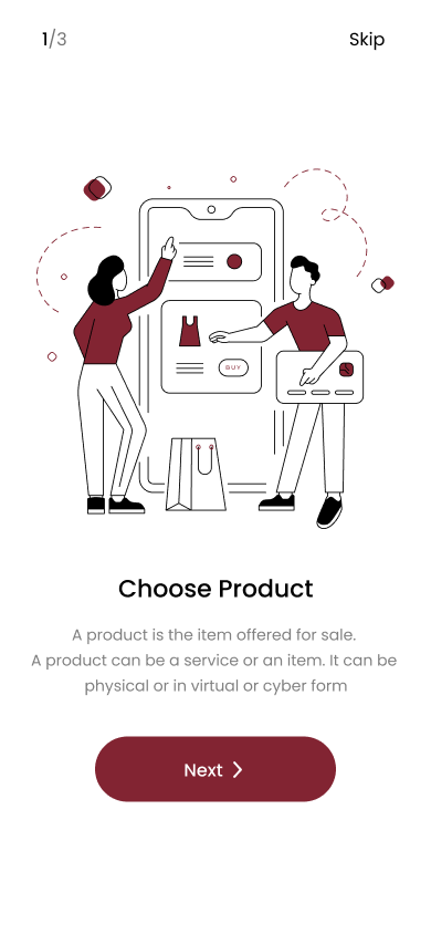
Line illustrations with maroon accents, a 1/3 counter and Skip on every slide.
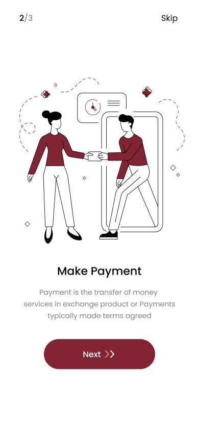
The same two characters carry the story from slide to slide.
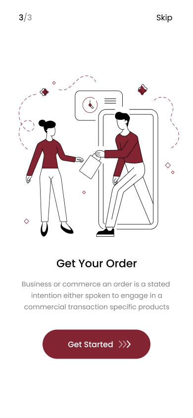
The button grows from one chevron to three, and Next becomes Get Started.
The slide copy reads like dictionary definitions (“A product is the item offered for sale…”) and only talks about buying. Improvement 01 rewrites it around buying and selling pre-loved fashion.
Every way in sits on one screen, and the phone path is built for India.
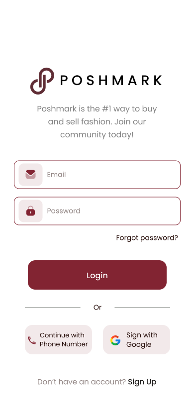
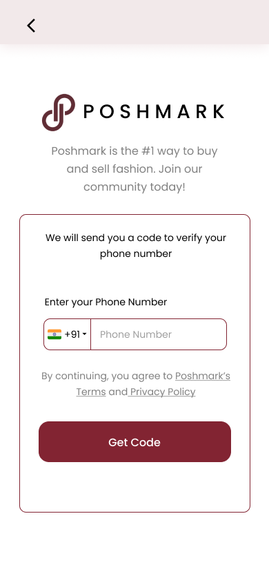
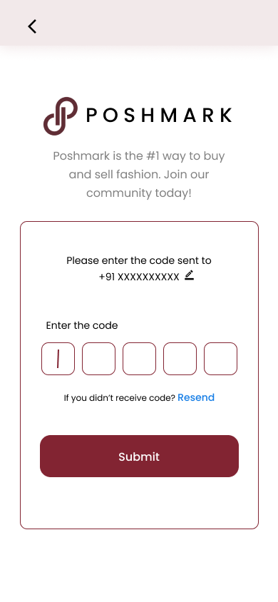
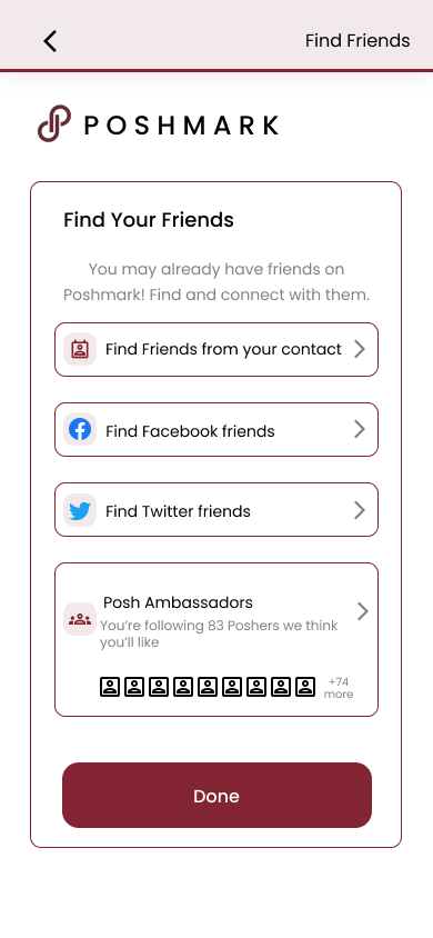
A short form, a warm welcome, and people to follow from day one.
Two quick choices, brands and sizes, shape everything you’ll see.
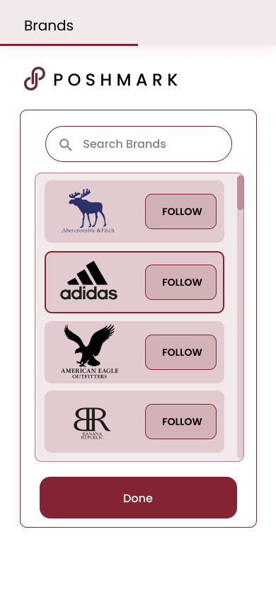
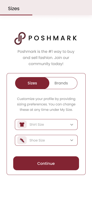
One sheet per item, with a toggle instead of extra screens.
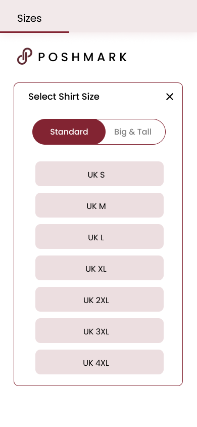
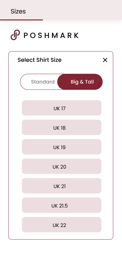
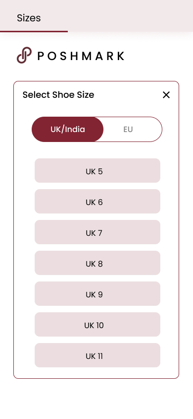
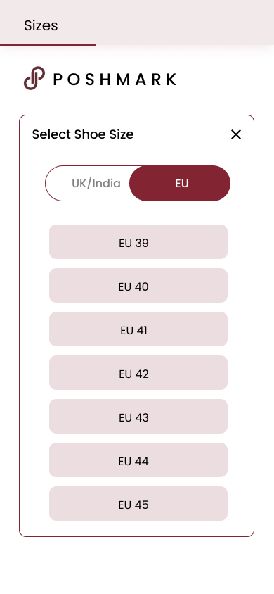
The pickers cover shirts and shoes. Women’s, kids’ and bottoms sizing can reuse the same sheet and toggle pattern.
A first version is a hypothesis. Here’s what I’d change and test next.
The slides read like dictionary definitions and only cover buying. Lead with the benefit, and give selling its own slide, since Arjun wants to sell his old pairs too.
“A product is the item offered for sale. A product can be a service or an item.”
Get Started leads straight to a sign-in wall. Offer “Browse first” and ask for an account at the first follow, like or purchase.
Login asks for an email and password, but sign-up never sets one. Add a password to step 1, or keep phone and Google as the only ways in.
Picked brands get only a thin outline, and a followed card still says FOLLOW. Add a tick and switch the label to Following.
The toggle lists Sizes before Brands, but Brands comes first, and the title underline shrinks from full to a third. Use one order and a clear step count.
Ask what someone shops for (Women, Men, Kids) instead of gender, let them untick the 83 auto-follows, and swap the Twitter bird for X.
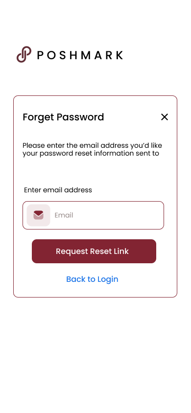
“Forget Password” next to “Forgot password?”, “Sign with Google”, “Find Friends from your contact”, and “Company” in Google’s consent text.
Grey body copy is 3.95:1 and the View More bar 3.77:1, both under 4.5:1. A darker grey and the brand maroon fix them.
Time install to first follow, and count who finishes sizes. A few sessions with new shoppers would show where they stall.